Refactoring to nested abstract components
Building a PDF Viewer with Vue - Part 4
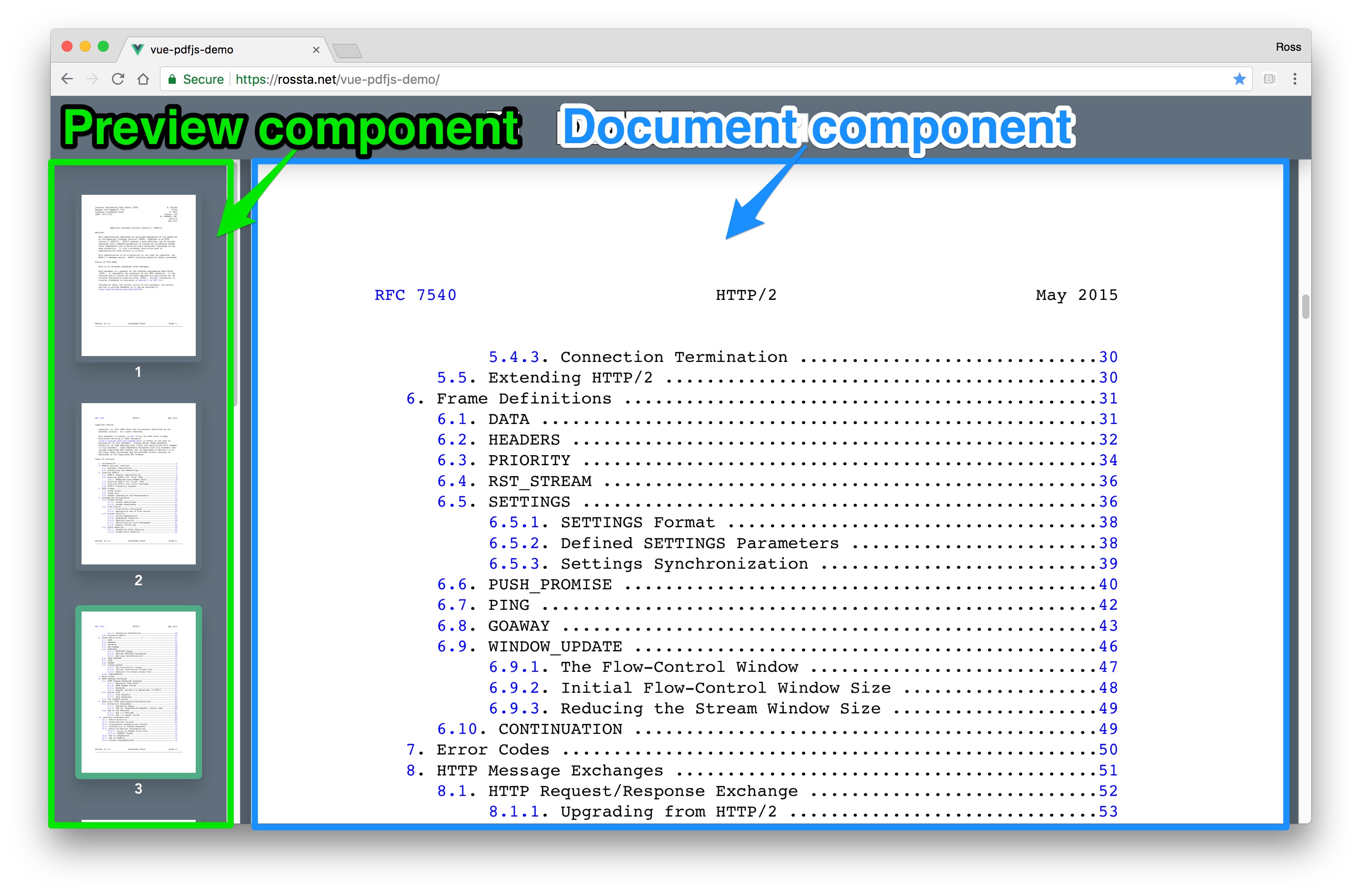
To add a preview pane to the Vue.js PDF viewer, I wanted it to have very similar behavior to the document pane. In this post, I'll demonstrate how I extracted this behavior with a set of components, as opposed to alternatives, like a mixin.
The project
This post is part of ongoing series, Building a PDF Viewer with Vue.js. The source code for this project is on Github at rossta/vue-pdfjs-demo. The source code for the behavior described in this post can be found in the tutorial/part-4-shared-behavior-components branch on Github.
Here's the latest project demo.
Catching up from last time
So far in this series, we have built a simple PDF viewer to render the pages of PDF document to <canvas> elements with Vue. We have also updated our components to fetch and render PDF pages lazily as they are scrolled into the viewport and we have extracted this behavior into a <PDFData> component.

The problem
At a high level, both the preview and document panes must:
- Be independently scrollable
- Trigger events, received by the data source, the
<PDFData>component, to fetch more page data as they are scrolled.
The new preview pane will have a similar layout to the document. Given the following component hierarchy for the current document viewer:
<PDFData>
  <PDFDocument>
    <PDFPage />
    <PDFPage />
    <PDFPage />
    ...
  </PDFDocument>
</PDFData>
That of the preview pane will be nearly identical:
<PDFData>
  <PDFPreview>
    <PDFThumbnail />
    <PDFThumbnail />
    <PDFThumbnail />
    ...
  </PDFPreview>
</PDFData>
Extracting the scroll-and-fetch functionality presents an interesting challenge because it is currently split between the <PDFDocument> and <PDFPage> components.
Among other things, the <PDFDocument> is responsible for determining when:
- the scrollable "boundary", i.e., where in the document the viewport is located
- the last fetched page has entered the viewport, i.e., when to fetch additional pages
The <PDFPage> is responsible for determining when it is visible by determining whether its boundaries overlap with the viewport.
The component-based solution
To share this behavior with the preview pane hierarchy, we'll create two abstract components, a <ScrollingPage> to take the responsibility of determing page visibility and a <ScrollingDocument> to absorb the properties and methods for determining the scroll boundaries and when the request more pages. We'll compose both the document and new preview panes from these new components.
The hierarchy becomes:
<PDFData>
  <PDFPreview>
    <ScrollingDocument>
      <ScrollingPage>
        <PDFThumbnail />
      </ScrollingPage>
      <ScrollingPage>
        <PDFThumbnail />
      </ScrollingPage>
      ...
    </ScrollingDocument>
  </PDFPreview>
  <PDFDocument>
    <ScrollingDocument>
      <ScrollingPage>
        <PDFPage />
      </ScrollingPage>
      <ScrollingPage>
        <PDFPage />
      </ScrollingPage>
      ...
    </ScrollingDocument>
  </PDFDocument>
</PDFData>
Rather than detailing all the changes, but I'll highlight some key takeaways about how I fit the pieces together.
First, these changes are made possible by Vue slots and slot-scope.
The <ScrollingPage> component is abstract, meaning it does not render any html itself. Instead, it delegates to its children, which, for our app, is a single <PDFPage>, through its render function while passing in additional properties via this.$scopedSlots. This is akin to calling the child component with arguments.
// src/components/ScrollingPage.vue

render() {
  return this.$scopedSlots.default({
    isElementVisible: this.isElementVisible,
  });
},
The <ScrollingDocument> uses a v-for loop to render each of the fetched pages as <ScrollingPage> components passing in properties the <ScrollingPage> needs to perform its calculations. Here is a simplified version of the <ScrollingDocument> template.
<template>
  <ScrollingPage
    v-for="page in pages"
    :key="page.pageNumber"
    v-bind="{page, scrollTop, clientHeight}"
    >
    <div
      class="scrolling-page"
      slot-scope="{isElementVisible}"
      >
      <slot v-bind="{page, isElementVisible}"></slot>
    </div>
  </ScrollingPage>
</template>
Note the use of the slot-scope to receive the isElementVisible prop passed in from the <ScrollingPage> scoped slot. This and the individual page prop, provided by the v-for loop, are passed on to the slot.
The new <PDFDocument> template below shows how this slot is used. It inserts <PDFPage> as a child of <ScrollingDocument> and extracts the key props with another usage of slot-scope (a slot-scope within a slot-scope!) while merging in an additional prop, scale.
<template>
  <ScrollingDocument
    class="pdf-document"
    v-bind="{pages, pageCount, currentPage}"
    @pages-fetch="onPagesFetch"
    >
    <PDFPage
      slot-scope="{page, isElementVisible}"
      v-bind="{scale, page, isElementVisible}"
    />
  </ScrollingDocument>
</template>
The <PDFPreview> is almost identical and demonstrates why we went to the trouble of using scoped slots
<template>
  <ScrollingDocument
    class="pdf-document"
    v-bind="{pages, pageCount, currentPage}"
    @pages-fetch="onPagesFetch"
    >
    <PDFThumbnail
      slot-scope="{page, isElementVisible}"
      v-bind="{scale, page, isElementVisible}"
    />
  </ScrollingDocument>
</template>
We can render a different experience in this part of the component hierachy by changing the component we give to the slot (the <PDFThumbnail>) while also getting the benefits of the shared behavior.
Stepping back
Note the contrast in this approach with mixins. It would have been arguably much more straight forward easier to move required props, methods, and hooks into separate mixins for the preview and document panes. While we could accomplish the goal of code-sharing, it comes at the cost of implicit dependencies, potential name clashes, and other aspects of mounting complexity we noted earlier.
Refactoring to components has a higher barrier to entry; it requires some extra thought and a grasp of slots and slot-scope (yes, it can get confusing).
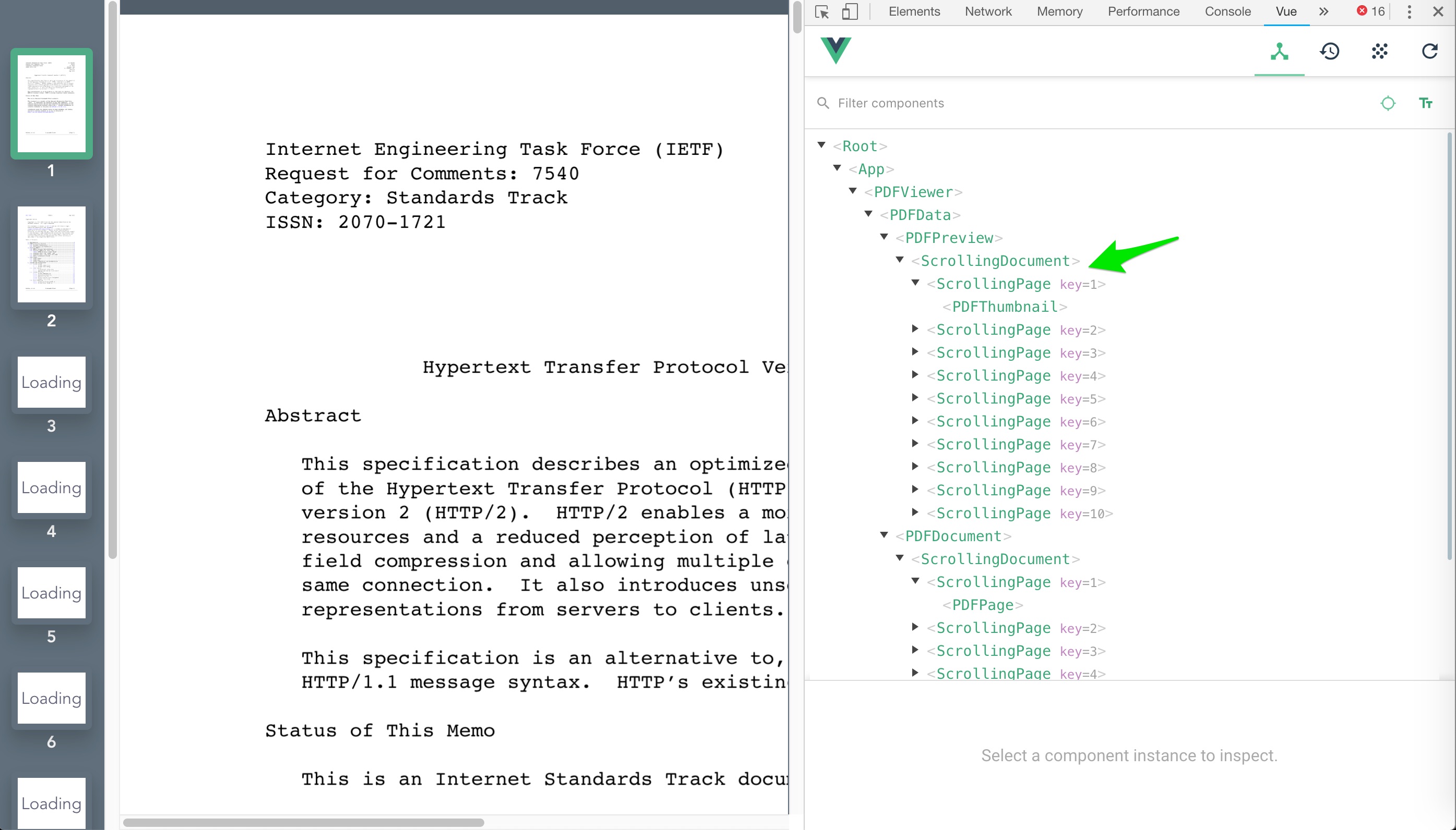
One practical advantage is we can troubleshoot the scrolling behavior with a clear picture of where the behavior is located in our component tree with Vue devtools:

In my opinion, this approach allows us to gain a clear separation of concerns and a better representation of how the pieces fit together as a whole; i.e., I believe the system is easier to understand and debug.
As I mentioned earlier, I left out many of the implementation details for the components described here. Feel free to check out the source code on Github. Make a pull request or let me know how I could improve things by reaching out on Twitter.
